


How to use colour in the garden: A Designer’s Guide
This month we invited Keri, founder of Studio Fitzpatrick, to share her expertise on how to use colour in garden design. From planting palettes that bring calm or energy, to the role of foliage, structure and even pots, her advice is grounded in real gardens and years of experience.
Rooted in feeling not fashion — this is colour theory for gardens that feel personal, lived-in and quietly full of life.
How to use colour in the garden by Keri Fitzpatrick

At the Studio, we believe gardens should feel like a natural extension of the home—beautiful, timeless, and deeply personal. One of the most powerful tools in achieving this is thoughtful use of colour.
A garden’s colour palette isn’t just about plants in bloom. It’s about mood, structure, and rhythm. It’s about creating a space that feels harmonious with its surroundings and in tune with the people who use it. With a little intention, colour becomes more than decoration—it becomes atmosphere.
START WITH FEELING, NOT FASHION
Ignore the gorgeous glossy pictures in the magazines and instead, before choosing your plants, start by asking yourself: How do I want this garden space to make me feel? Energised and invigorated? Calm and restful? Uplifted or grounded? Understanding the emotions you want to evoke is the foundation for creating a garden that truly reflects you, and in doing so will encourage you to spend more time in your garden.
Colour is a direct route to that emotional tone. Cool blues and silver greens invite stillness. Deep purples and warm terracotta’s bring richness and depth. Every shade carries a subtle message—and in the garden, it’s magnified by light, season, and setting.
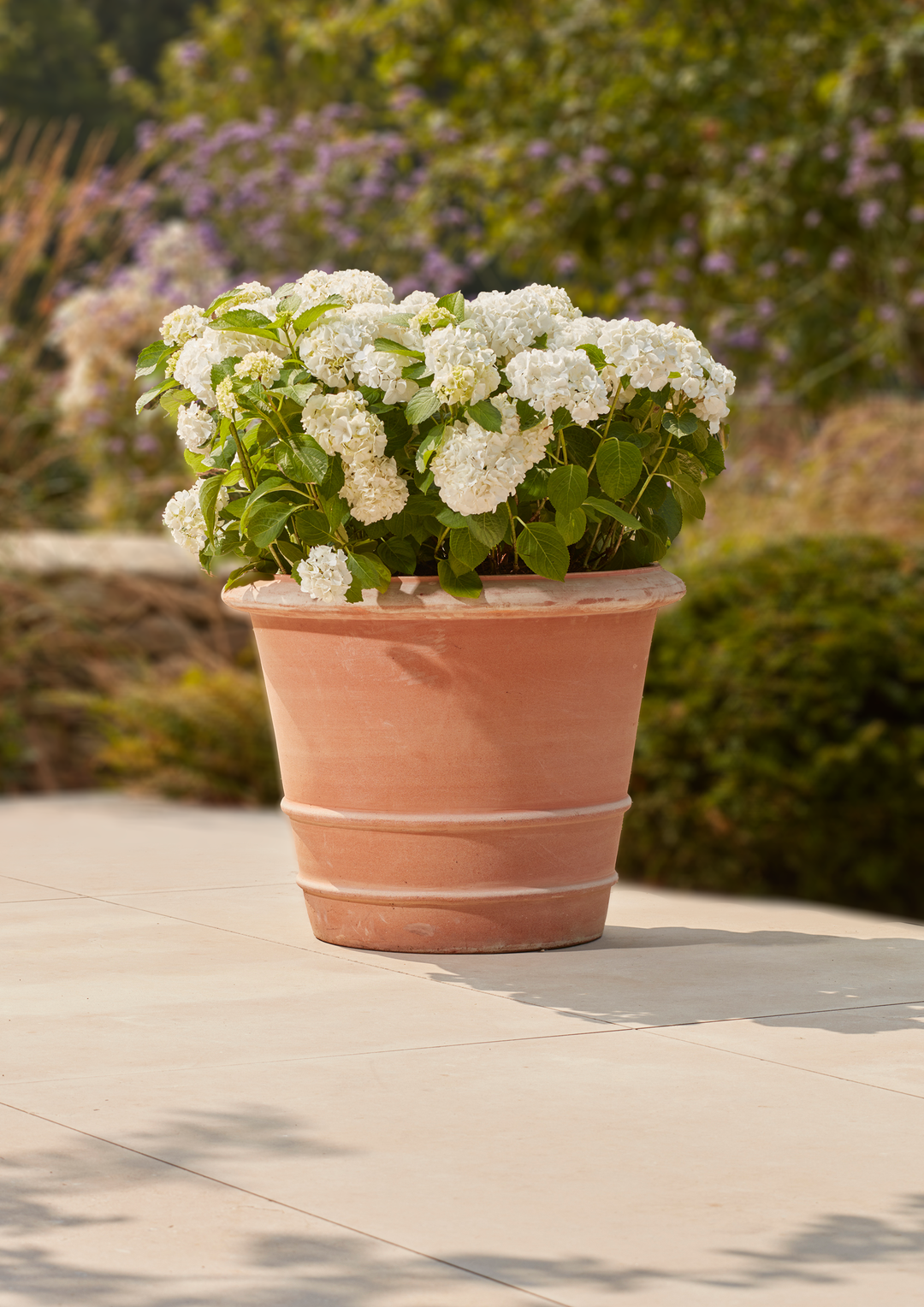
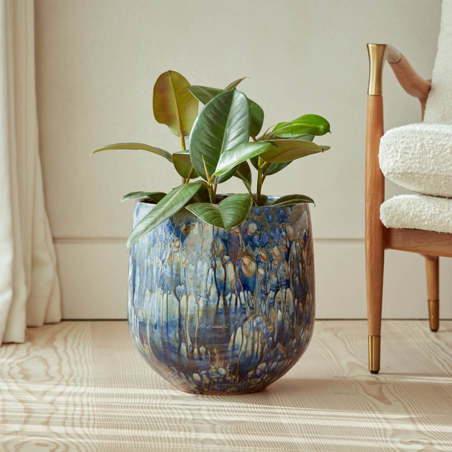
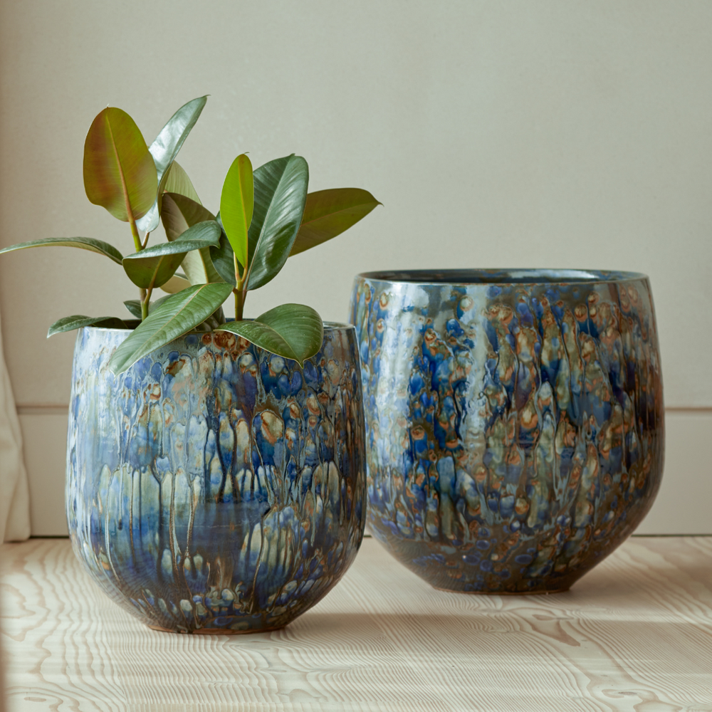
One of my go-to choices for adding a splash of colour is the Gardenesque Eris Glazed Plant Pot. While each glaze variation has its charm, I’m especially drawn to the turquoise—it feels vibrant yet timeless.
For a soft and sophisticated planting palette to complement the pot, I recommend combining Geranium ‘Rozanne’, Salvia ‘Caradonna’, and Festuca glauca ‘Elijah Blue’. The geranium brings generous, long-season colour and will gently spill over the pot’s edge, softening its form. Salvia ‘Caradonna’ adds vertical structure and a sense of rhythm, while the cool-toned festuca acts as a quiet unifier—its silvery blue foliage echoing both the glaze and the tones within the other plants.

If you're looking to introduce a gentle sense of movement and sound into your garden, the new Esme Large Globe Water Feature is a beautiful addition. I often recommend placing it near a seating area—tucked into planting yet given enough space to be appreciated from different angles. What I love most about the Esme is the subtle colour fade across the glazed surface, which catches light and shadow in the most calming way. Each piece feels genuinely special—crafted with care and full of quiet character.
THE TWO PRINCIPLES: HARMONY AND CONTRAST
Understanding a few core principles can bring clarity and confidence to your colour choices. I always return to these two foundations:
1. Harmony
Harmonious colour schemes are composed of hues that sit next to one another on the colour wheel—such as blue, blue-violet and violet. These combinations feel soft, sophisticated and fluid.
They work beautifully in gardens where calmness is the goal, or where you want the planting to sit gently within a larger composition.
A great example, using just a few of our favourite plants is:
• Salvia nemorosa ‘Caradonna’ (rich violet)
• Nepeta ‘Walker’s Low’ (misted blue-lavender)
• Penstemon ‘Catherine de la Mare’ (soft violet)
Together, they form a cool, cohesive palette with graceful rhythm and layered interest.
2. Contrast
Contrast adds energy and movement. By using colours from opposite sides of the wheel—such as orange with blue, or violet with yellow green—you create dynamic pairings that draw the eye and hold attention.
For a striking contrast planting, consider:
• Geum ‘Totally Tangerine’ — luminous apricot-orange blooms with a long flowering season
• Nepeta ‘Walker’s Low’ — soft, hazy blue-lavender spires with aromatic grey-green foliage
• Iris ‘Sharp Dressed Man’ — rich, inky-violet petals with bold, upright form
This combination brings together vibrant complementary hues—orange and violet—softened by the calming influence of nepeta’s cool tones. The varied textures and flower forms, from the airy informality of Geum to the structural elegance of Iris, create a planting scheme full of colour contrast, movement, and quiet sophistication.

USE FOLIAGE AS FOUNDATION
While flowers provide seasonal highlights, foliage brings structure, longevity and tonal subtlety. Afterall, we see much more of the foliage of any given plant through the year than we do of its flowers.
At the studio, we carefully consider the interplay between foliage and flower colour—warm versus cool greens, matte versus glossy textures, and contrasting leaf shapes—all of which influence how a planting scheme reads.
In darker corners, pale greens and variegated leaves can brighten and lift. In exposed spaces, darker foliage grounds the scheme and lends depth. The more variety in texture and contrast, will provide increased interest in your garden over a longer period.
GREEN AS YOUR CONSTANT—AND WHITE AS A PAUSE
Green is nature’s neutral. It supports and connects bolder hues, provides rest for the eye, and fosters a sense of unity across the garden. White plays a similar role—lifting more saturated palettes or creating quiet moments within a busier mix of colours.
Both are essential tools in any planting plan. Used with restraint and consistency, they can bring elegance and order to your scheme.

DESIGNING WITH THE COLOUR WHEEL
The colour wheel is much more than just an artist’s tool—it’s an essential guide that helps bring clarity and intention to your planting design. When used thoughtfully, it helps create a planting scheme that feels both cohesive and intentional. Here’s how I suggest approaching it:
1. Choose the Mood
Begin by deciding the atmosphere you want your garden to evoke. Do you want it to feel serene and restful, energising and vibrant, or perhaps warm and inviting? Your colour choices will be the palette that paints this mood, setting the emotional tone of the space.
2. Select an Approach
Next, decide whether you’ll lean into harmony, contrast, or a carefully balanced blend of both. Harmony offers calm and unity with colours that sit close together on the wheel, while contrast creates energy and excitement with colours that are opposites or sharply different. Both approaches have their place—it’s about what suits your style and the space best.
3. Layer Tones for Nuance
Colour isn’t just about pure hues. Incorporating tints (lighter versions), tones (softened, muted colours), and shades (darker, richer depths) adds subtlety and sophistication to your palette. These layers create a garden that feels nuanced and dynamic rather than flat or overwhelming.
4. Build Around Foliage
Think of foliage as the framework or scaffolding of your design—it provides texture, structure, and a calming backdrop for your chosen blooms. Different greens, silvers, and even burgundies can create depth and link your colour scheme naturally to your garden’s architecture and materials.
5. Repeat and Edit
Repetition is key to rhythm and flow—it guides the eye and brings harmony across your space. But equally important is restraint: knowing when to pause, when to edit back, and when to let certain colours or plants shine without competition. This balance between repetition and refinement gives your garden its timeless, considered feel.

BEYOND PLANTS: THE BIGGER PICTURE
At the studio, we always consider colour as part of a wider palette that includes materials, textures, and finishes.
Fence lines, for example, are often treated with near-black or deep olive tones. These recede from view, allowing foliage and flowers to take the spotlight. Painted boundaries also become a canvas for vertical planting, encouraging greenery to climb, soften, and blur the edges of the space.
We also ensure the colours in the garden are in conversation with the home—whether that’s through complementary tones, architectural echoes, or curated contrasts.
A FINAL NOTE
Hopefully, you feel more confident in selecting your own colour palette for the garden. But a final token of thought; your garden should always reflect you. Embrace experimentation and trust your instincts. Sometimes, it’s a single standout plant, a beautifully glazed pot, or an unexpected splash of colour that brings your whole scheme to life. Enjoy being creative and watch your garden evolve.
Read More on our Blog